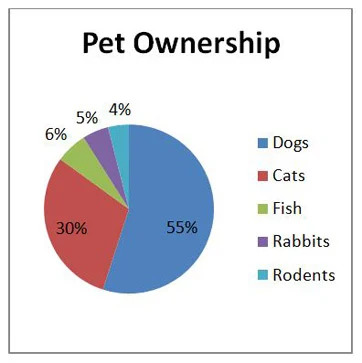
This is what most of you are familiar with, or the first thing that comes into mind when you think of presenting data. Pie graphs are mostly useful in comparing certain numbers of something to a vast category (ex. The number of a specific species of tree in a forest) overall.
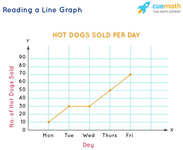
| Line Graph |
Line graphs are used to compare over time' when' the timespan is short/if you want to show the reactions of things over time. Note that both bar graphs and line graphs use x axis as the IV and y axis as DV. |
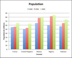
| Bar Graph |
Bar graphs are used to compare different numerical quantities. For example: comparing different sugar levels of foods. |
| This is often used also when using time as an indicator when the timespans are long (ex. Months, years) instead of using line graphs. Line graphs can be inaccurate when you use them for long time quantities. Note: Make sure to use a ruler and double check data before coloring! |
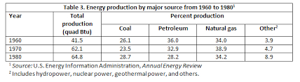
| Table |
|
| Just your normal table. Like this but without “table 1.” That's on top of the table, not in it. This is the general formula for a table. However, sometimes you may be asked to calculate the mean if needed. |